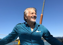
John Oliver on Last week Tonight pointed out that when broadcasters bring on a scientist and a climate denier for a "debate", they are skewing the audience's perception of the relative merits of their positions by giving them equal screen space, thus:
When there is a 97% scientific consensus on the reality and seriousness of AGW, and only 3% of scientists disagree, the audience is not well served by suggesting that there is some kind of parity between the positions by the equal side by side images. John Oliver humorously suggested that the audience would get a more realistic view of the merits by bringing in to the studio 97 scientists who supported the consensus view, along with 3 who did not. While that made for good comedy, it's obviously not a workable solution to the problem of how to show where the balance of scientific opinion lies.
I suggest that broadcasters could quite easily demonstrate to their audiences where the weight of evidence lies by simply showing the interviewees in sizes relative to the percentage of scientists who support their positions, thus:
Audiences would be well served by this graphic representation of the weight of scientific opinion. But would broadcasters do their viewers the favor of informing them well in this manner? Of course not - they don't have the balls.
Update 11/25/2014
German TV shows us how to interview responsibly:
https://www.youtube.com/watch?v=Y1eUeWpmnf4
Thursday, June 26, 2014
Subscribe to:
Comments (Atom)


